What prompts a consumer to pick up your product over the several others that line a busy supermarket shelf? Marketing psychology tells us that product packaging is one of the biggest reasons.
From visual cues like colour, to the appeal of its shape, and even the tactile sensations of the material, there’s a lot of thought that goes into packaging material. While the intention of packaging is essentially to secure the contents of the product, it plays an important marketing role as well. It is often termed the ‘silent salesman’ as it can be used to advertise the key features of your product.
Marketing psychology uses cultivated or inherent consumer biases to design products that are likely to get more attention from consumers.
There are some cues to keep in mind when you’re designing and choosing packaging.
Packaging Colour
The concept of colour resonance has been in use for years and refers to the idea that colours influence people in a variety of ways. For instance, bright cheerful colours can usher in a more pleasant state of mind. Colours also connote certain meanings. The colour blue, for example, in many cultural contexts signifies trust, while white symbolises purity. Considering colour in your product design is an excellent way to associate certain feelings and emotions to your product.
Packaging Materials
Materials influence the overall look and messaging of the product itself. So, you can choose materials with the intention of creating a specific type of look.
- Glass jars: Glass bottles and jars are perceived as being made from highly sustainable material. It’s ideally suited for food products and sometimes even cosmetics.
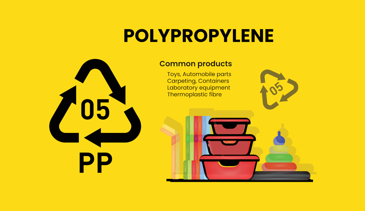
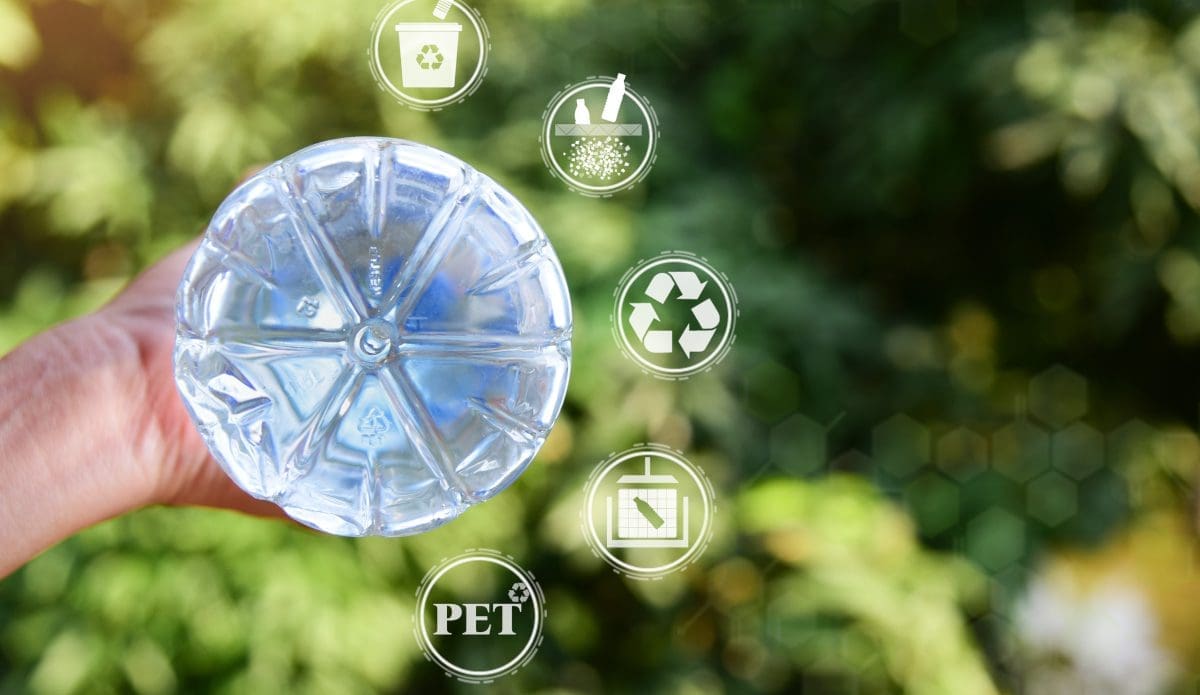
- Plastic bottles: HDPE, LDPE and PET bottles are other options that are both durable and secure for a variety of contents. Depending on the need of your product, you can also choose from a range of neck widths and shapes.
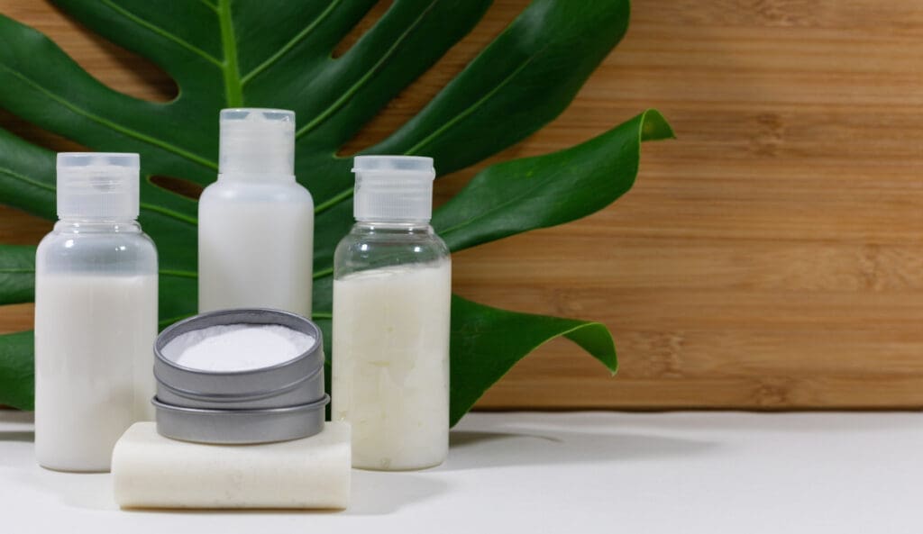
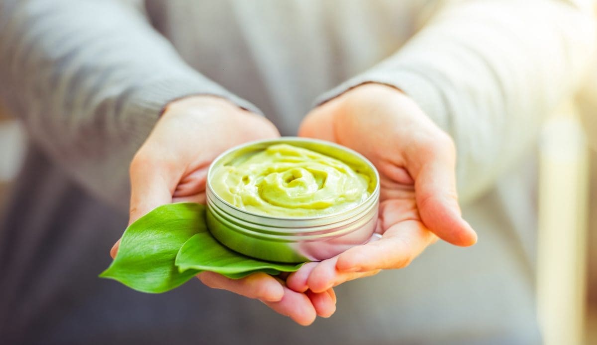
- Cosmetic bottles: Cosmetic bottles often have specific requirements that need to account for storage, convenient dispensing, and visual appeal. Depending on the kind of look you want to create, there are cosmetic containers in a number of colours and from opaque to transparent shades. These jars, bottles, tubes, and tins can hold anything from a cream to a liquid solution.
For a product that is meant to imply a sense of premium appeal, clear or transparent bottles are often used. On the other hand, a straightforward tube of toothpaste can be an opaque white as it needs to only convey functionality.
Tactile Appeal
Sensory marketing tells us that cues which appeal to the five human senses connect best with consumers. In this context, ‘tactile’ or the sense of touch, is the next thing to consider. Even holding on to the product for a few seconds ushers in a sense of ownership and this increases the likelihood of the potential customer becoming a buyer. So, designing a product’s packaging in way that persuades consumers to pick it up is an important part of the process.
Shape, Structure and Convenience
Especially for cosmetic products, it is important to consider the way certain creams, powders and liquids are stored as well as the way they need to be dispensed. When it comes to these products, the packaging contributes to the consumer experience just as much as the product itself. If too much of the cream squirts out of the tube at any given time, it isn’t convenient for the consumer. Nor does it work if it’s too little.
The shape of a product influences the user experience, but it also plays a visual role in drawing a consumer’s attention while on the shelf. Unusual shapes stand out more than conventional squares and rectangles that most products are. Curves are usually preferred over straight edges.
Fonts and Typography
Just as it is with colour cues, typography and fonts carry different connotations. In fact, every little piece of product packaging contributes to creating an ‘aura’ or the feel that you want ascribed to your product. Hand scripted fonts carry a sense of casual playfulness while headline fonts are intense and decorative fonts create a sense of whimsy.
The Product ‘Unboxing Experience’
Product packaging needs to keep up with the times and another thing to consider in today’s era of social influencers and visual reviews is the ‘unboxing experience.’ Consumers first review your product on pure visual merit and the more appealing your packaging is, the better. The unboxing experience refers to the feelings a consumer has when they unwrap the packaging of your product. If it is convenient and interesting to open up, it tends to influence the review of their product. Today, there is a great value placed on creating a niche or one-of-a-kind unboxing experience for your customer.
Packaging Makes the Difference
Every scrap of communication that your products, marketing campaigns and brand ambassadors make up the entirety of your brand’s image. Product packaging is no exception. While choosing the colours and design of your packaging, factor in your branding. Being able to identify your product in a crowded retail aisle goes a long way in ensuring brand loyalty. If your customers can find your products easily, they’re more likely to add it to their baskets.