Eating With Your Eyes: The Role of Colour in Food Packaging
The use of colour in packaging is important. It evokes different emotions and feelings, and influence buying behaviour.
A study in 2006 found that about 62 to 90 percent of consumer’s initial appraisal of a product is exclusively driven by colours. That’s a huge effect, by a fairly basic- and overlooked- element of food packaging design.
Research in 2009 stressed the importance of time in decision making. Consumers spend a maximum of 90 seconds interaction from beginning to end with a product. Time is a luxury, and purchase decision is usually swift. In 20 minutes of shopping, consumers read only eight lines or less; colour and imagery is more important that the text. And, 75% of decisions about a purchase are based purely on colour.
A study in 2017 found that tobacco companies used colours on packs to manipulate users. Lighter colours were used to make smokers think the taste was lighter and less harmful, while red and darker colours were used to infer stronger, fuller flavoured. A red band was minimised or increased to show strength variance. Different colours were used to change perceptions about the flavour of the cigarettes. They used a strategy called ‘sensation transference’ where consumers associate feelings derived from the packaging, onto the product itself.
So what can you learn about colours that you can apply to your product packaging?
Not All Situations Are the Same
You’ll often see colour inferences listed:
- Blue: Honesty and dependability
- Red: Daring, risky, exciting, modern
- Green: Fresh, imaginative, confident
- Purple: Edgy, feminine, expensive
- Orange and yellow: Cheerful, optimistic
But it’s not that simple.
- Colour perceptions change over time. Pink, for instance, is now associated with femininity and girlishness. However, in the 19th Century, pink was viewed as a masculine colour, while girls typically wore blue and white. And while this change happened over 100 years ago, fashion changes are typically fast; last year’s trendy soft green might now be viewed as insipid.
- There are about 8% of men and less than 1% of women who are, in some form, colourblind. It’s a small percentage, but it’s worth thinking about. Red/green colour-blindness is the most common form.
- Colours are perceived differently on a website to on packaging. This is why companies should use A/B testing at every turn; changing a green coloured button to red might increase a sign-up or conversion rate by up to 21%! (Which goes against all traditional beliefs that green= go and red= stop).
- Colours have different meanings in different cultures. Red is a colour for brides in India and China, while white is still the predominate bridal colour in Western countries (and, no one wore white to their wedding until Queen Victoria did in 1840). Purple is an unlucky colour in Italy, but in Western culture it’s associated with royalty.
So while colour is important, there are multiple factors and there’s no correct answer which is consistent across time and culture… and, everyone is different. So you need to think about how colour might apply to branding, rather than picking a colour to represent some integral function or quality in your product.
You Can Use Colour to Make Your Brand
Cadbury’s is a luxury, royal purple. Apple is a simple, pure, white. Tiffany’s is a luxe robin’s egg blue. Over time by consistently using a colour that is related to your brand, the colour can become ‘your’ brand.
You Can Use Colours Across Different Products
Garnier Fructis shampoos come in a range of ‘flavours’, and the bottles are accordingly coloured. The creamy mango shampoo bottle is yellow, and the pomegranate clarifying shampoo bottle is pink. If you have a range of products with significant differences, you can choose different colours to differentiate between the product lines.
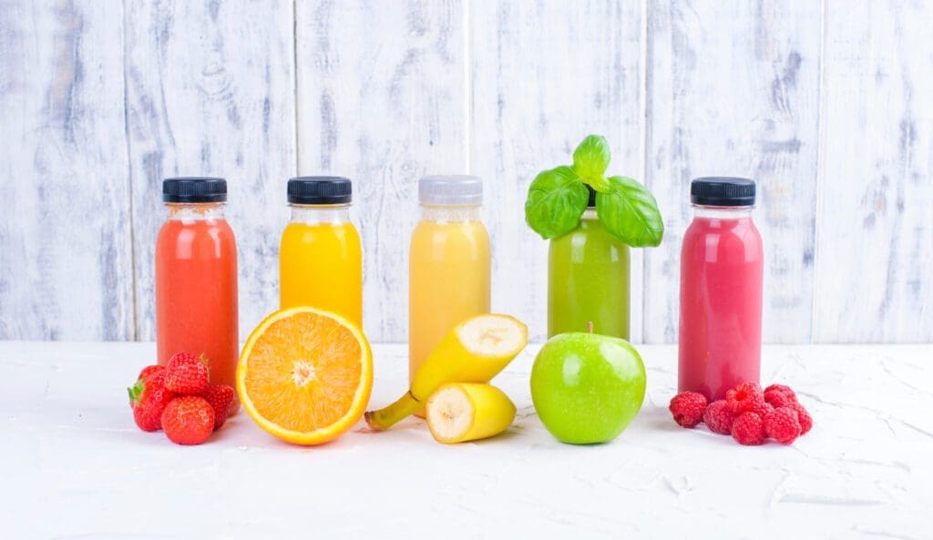
Colours Are Linked to Flavours
Like Garnier’s shampoo, colours and flavours are linked. We know spinach is green, and lemons are yellow. This is why blue is typically not found in food packaging; outside of blueberries, there’s not many blue foods… yet, this could be a way to stand out from the competition.
Be Wary of Green
Green is no longer just a colour; it’s an industry. Everything is green, from packaging, to ethos, to the product itself. The entire marketing industry is greenwashing everything. If you decide your colour is going to be green, look at all your competitors. Are they also green? Will your product stand out, or be just another green on the shelf?
Carry Out Consumer Testing First
Colour is vitally important in packaging. However, there is no right or wrong colour choice; it depends on your target market, the type of product you’re selling, your brand ethos, and your marketing strategy.
If you’re selling a mango yoghurt, for example, the logical colour could be orange. But in a refrigerator full of mango yoghurt, can you stand out if you use orange? If you used yellow instead, would people associate that with bananas?
There is no replacement for consumer testing. And this should be more than emailing your immediate family and friends and asking them their opinion. Asking people from different cultures within your target market (remember, NZ is increasingly becoming culturally and ethnically diverse) is important. Trial products on a shelf; how many people pick it up, how many of them convert to sales?
Choosing the right colour for your packaging is a vital choice and can be the difference between failure or success. Here at Comag, we’ve had decades of experience in helping our customers choose the right packaging option. Contact us for help in choosing the right packaging, so that you’ve got the best foundation for your beautifully coloured products